Introduction
In the Fall 2021 semester, I endeavored my capstone project, the final project of the Digital Media & IT program at NAIT (Northern Alberta Institute of Technology). My capstone project involved working with the Give for Good foundation, a non-profit organization that aims to connect those in need with those who have something to give. I worked with 4 other student developers as a developer and designer to help Give for Good bring their mission to life.
Give for Good wished to have a classified advertisement website where people, businesses, and charities can post about goods or services they are willing to donate (those that can give are givers). Those in need can view these posts and create posts requesting items or services they require. Charities can also request goods/services and manage users under their charity that can ask for goods/services (called receivers).
A previous capstone team already laid the foundation and created the first version of the website. Many basic features were already implemented, but some were not and some of the features that existed were broken. Our team's goal was to bring the website closer to a launch-ready state.
This project was done using the Scrum framework, a subset of the Agile technique. The business analyst student acted as the Scrum master and acting product owner (when necessary). The five developers on our team made up the development team. We completed 4 two-week sprints and 1 week-long sprint.
Technology
The website was built using the TALL stack: Tailwind CSS, AlpineJS, Laravel, and Livewire. Laravel, a PHP framework that was installed via Laravel Breeze. The pages were styled with Tailwind CSS. For the website redesign, I attempted to remove as much of the Tailwind references as I could and utilize custom styling.
AlpineJS is a JavaScript framework used to add interactivity to page features. Livewire is a full-stack framework for Laravel for creating dynamic interfaces, similar to React. This PHP-based project used MySQL to make database changes and phpMyAdmin for database administration.
Tasks
Group & Individual Tasks
As a group, most of our work involved updating and adding on to existing features. We all tested the website prior to making these changes. The major changes we made are listed below. I was involved with the bolded tasks, either partially or solely responsible for them.
Major Tasks
- Remaking the registration process
- Completing the email feature
- Fixing charity account creation
- Completing the post reporting feature
- Adding more pages and features to the administrator panel
- Updating account permissions
- Updating account profile features
- Changing the language throughout the website to be clearer
- Redesigning the dashboard to meet specific client requests
- Making the website responsive & mobile-friendly
- Redesigning the website to meet branding style
My role as a developer meant that I (and the rest of the team) was responsible for adding new features and pages, as well as fixing existing bugs. As the designer, I was tasked with creating a mockup for new pages and redesigning existing pages. The full details of my tasks are given below.
My Tasks
- Updated language on all pages to be clearer
- Updated account profiles to add/remove fields as per client request
- Updated receiver extension request form to add charity selection
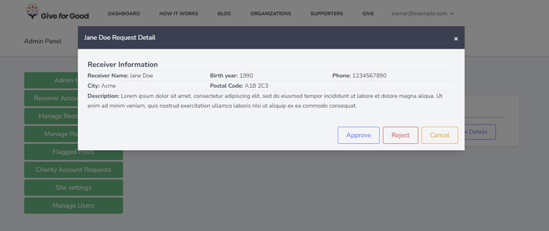
- Added rejection and charity fields to the receiver account request preview in the administrator panel
- Added a page to view all rejected receiver requests in administrator panel*
- Added extra features on the post details page (image navigation via arrow keys, view map links, show filterable post details if provided, show post author on contact form)
- Updated navigation menu to show links according to account permissions
- Added the visual components of the post reporting feature
- Created a mockup for the new registration page
- Styled the new registration page
- Redesigned all website pages, including the dashboard
- Made all website pages excluding the administrator panel responsive/mobile-friendly

click image for full view
*To create the new Rejected Receivers page to the administrator panel, I had to understand how other similar pages were structured. I studied the page to view pending receiver requests, which was created by the previous team, and noted which files were associated with the page. Then I mapped out the structure of the files for the page I was going to create. You can see in the above image that I specified which files already existed (and had to be updated) and which ones had to be created. I also indicated which files contained the model, view, and controller.
From there, I was able to create the new pages and update the appropriate pages with ease. The new page was implemented swiftly thanks to my experience with models and prior PHP/MySQL knowledge. Doing this was not only helpful for me, but for my teammates who had to do the same for the new pages they created as well.
In addition to my tasks, I made several suggestions that were eventually implemented on the website, either by me or another teammate. These ideas included adding a charity selection for receiver extension requests, providing the options when selecting a reason for reporting a post, the multi-page registration form, the removal of unnecessary public pages and footer content, additional information for the details modal in the administrator panel (for receiver requests, rejected receivers, and charity request pages), and a temporary solution for the website's profanity filter.
Branding Guidelines
The previous version of the website was not responsive, user-friendly, nor cohesive with Give for Good's branding style. An audit was performed to give UI & UX suggestions, which our team worked off to fix UI issues. Guidelines for language, website flow, branding colors, typography, and HTML element styles were provided.
- Heading 1
- Heading 2
- Heading 3
- Paragraph Text
- Alternate Paragraph Text
Give for Good design guidelines & color palette
Changes to the Registration Process
The biggest task I took part in was creating the new registration pages. The old registration process involved signing up via the register page with an email and password, then selecting the account type on the dashboard page.
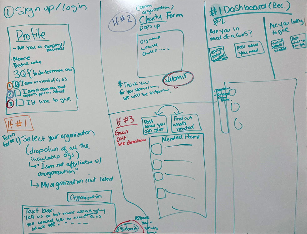
The client wanted to remove the account choice page as per the audit and replace it with a multi-form process, with additional forms showing depending on the account type the user chooses upon registering. The above image is the drawing the client provided (left and middle sections).
Registration Pathway Redesign
I was responsible for creating a mockup of the new registration pages based on the client's drawing. I noted that the client's drawing had multiple submit buttons for the different forms the user fills out depending on their account type. Thinking as a developer and general website user, I knew that displaying multiple forms to submit was not ideal from a back-end and UX perspective, as a long multi-form page could turn away potential users.
I asked the team if we were capable of creating a multi-page registration pathway in case I did not code the back-end. I envisioned the main registration "form", with the other "forms" appearing on another page. Once I was assured that it was possible, I created the mockups in Adobe Photoshop following the audit design guidelines.
Mockup of the default registration form. Other parts of the form will show/hide depending on the user's selections.
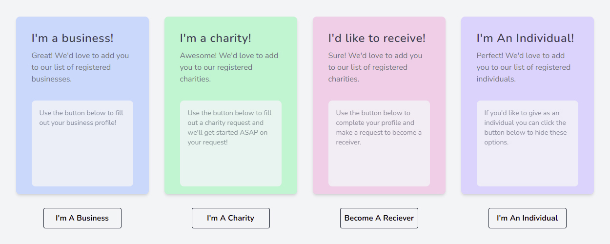
If a business account is being created, business information fields will appear.
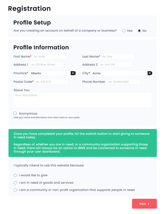
If the user is creating a non-business account, they are shown an information box explaining that all accounts can donate goods/services. Then, they must select an account type: giver, receiver, or charity. If they select a giver account, the bottom button turns into a submit button that finishes the registration process. If they select a receiver or charity account, another form must be filled out on the next page.
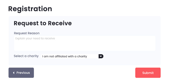
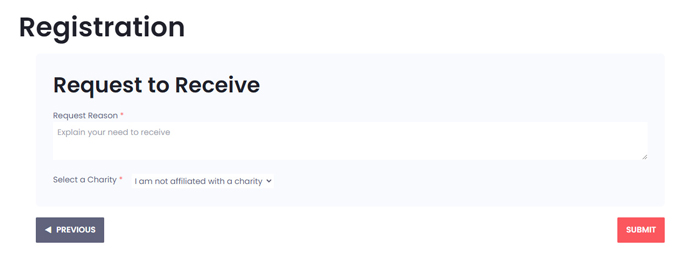
Receiver accounts must submit a receiver account request. They submit a request reason and select their associated charity if they are affiliated with Give for Good. Upon completion, the account is created but does not have the receiver status until it is approved by the website administrator or their charity's administrator account.
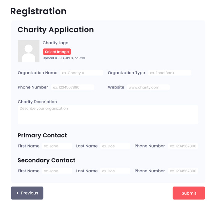
Charity accounts must submit a charity account request with appropriate information. Upon completion, the account is created but its status as a charity account is pending until the website administrator approves/rejects the request.
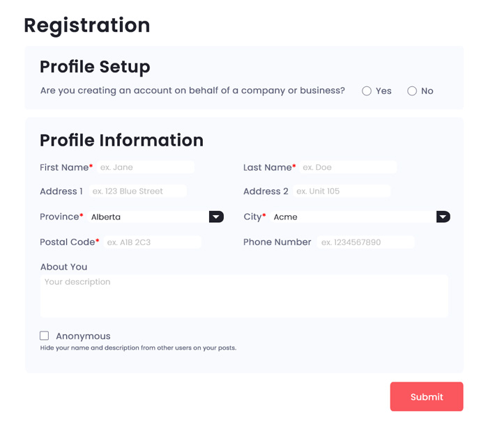
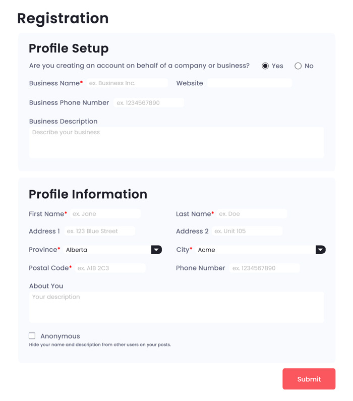
New Registration Pages
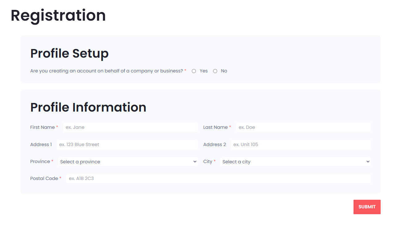
Default registration form on the website. We removed the phone number and description fields as those fields show up in the upper section for business accounts.
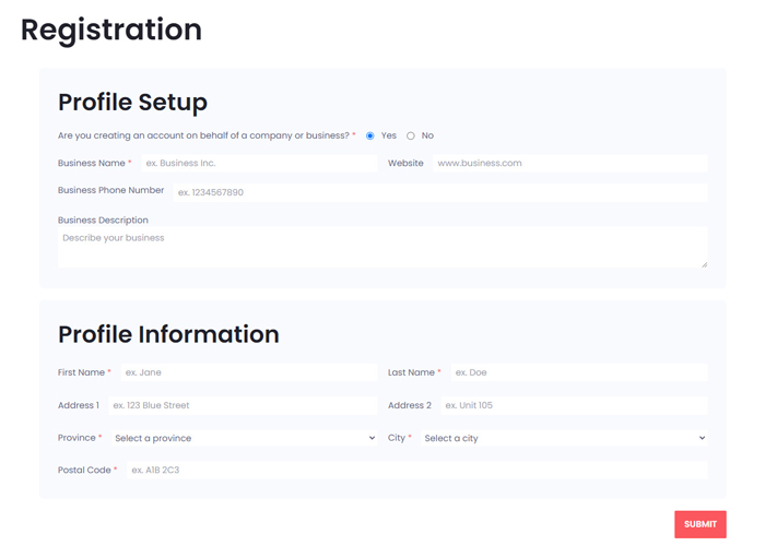
Registration form for business accounts.
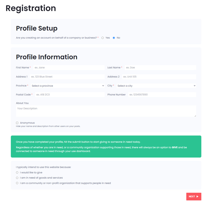
Registration form for non-business accounts. Note that the phone number, description, and anonymous feature show up by default.
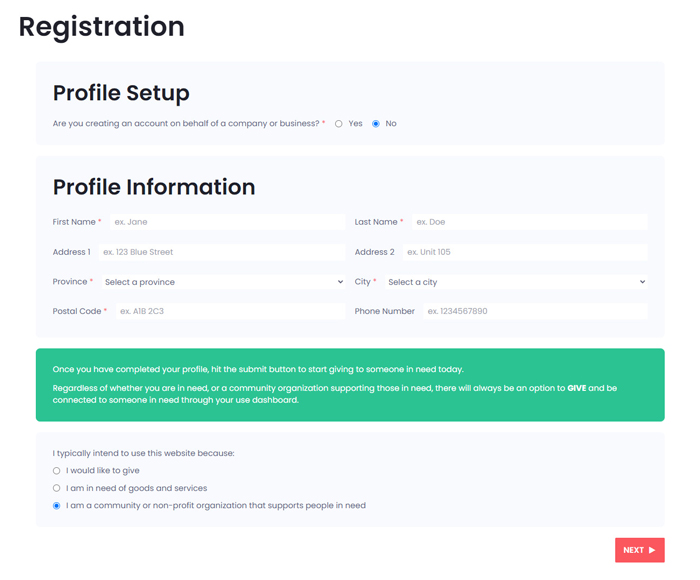
Registration form for charity accounts. Note that the phone number, description, and anonymous feature disappear for charity accounts. We did not want to have those fields appear if the user selected the giver or receiver accounts as that would have been confusing for users.
Receiver request form. Receiver accounts must get approval from the website or charity administrator, otherwise the account operates like a giver account.
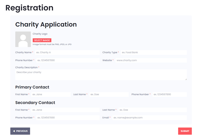
Charity request form. Charity accounts must get approval from the website administrator, otherwise the account operates like a giver account. The data from the previous page will persist, so if the phone number field on the previous page was filled out, that information would populate the primary contact phone number field. Note that we added an email field for the secondary contact, but not the primary contact as their email is the email that was used upon registering.
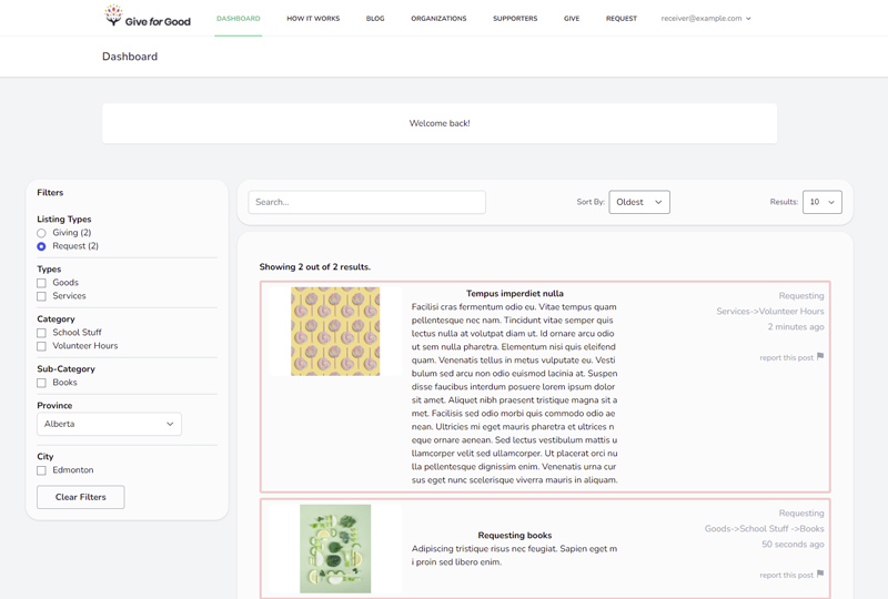
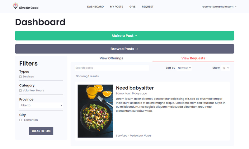
Dashboard Redesign
The only other changes the client explicitly provided was a division of the dashboard page. We did not have time for a proper mockup to be created, but the client's requirements were very clear.
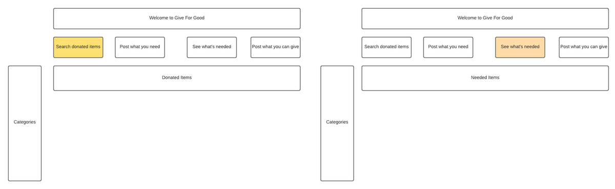
(Dashboard drawing on right section of image.) The client wanted to make it clear to users what they are able to do, and requested the dashboard be divided into 2 parts: one section for those in need and one section for those who can give.
click image for full view
The business analyst student converted the client's drawing into a readable diagram for the developers. The post feed has a categories sidebar for filtering on the left. The client specifically requested for 4 buttons on the dashboard page: a button to view giving (donation) posts, a button to give (donate), a button to view request posts, and a button to make a request.
If the user does not have the ability to receive, then they cannot make request posts nor view giving posts.
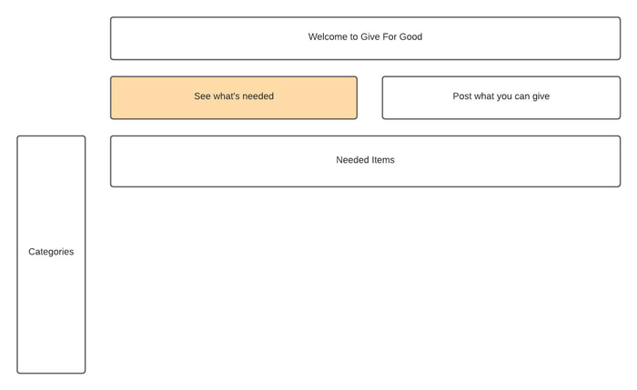
I split the dashboard into the following collapsible sections: a "make a post" section and the post feed section. The user can interact with each section according to what they want to post/view: giving or receiving posts.

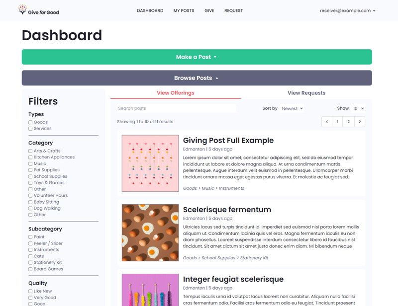
New dashboard with buttons to toggle the "Make a Post" and post feed sections. If the user is not an approved receiver or charity, they will only see the "Make an offer" button.

click image for full view
Old (left/top on mobile) and new (right/bottom on mobile) dashboard. The client wanted big buttons to filter between viewing giving and receiving posts. I opted for tab-style buttons, which gave the illusion of two post feeds for each post type.
click image for full view
Old and new dashboard showing the receiving posts.
I was unable to make mockups for the rest of the website due to time constraints. Luckily, because the other pages already existed, I was able to redesign them without a mockup.
Post Pages Redesign
click image for full view
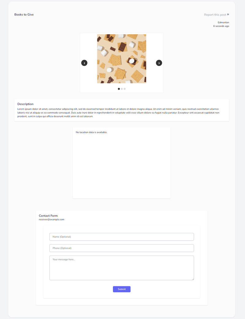
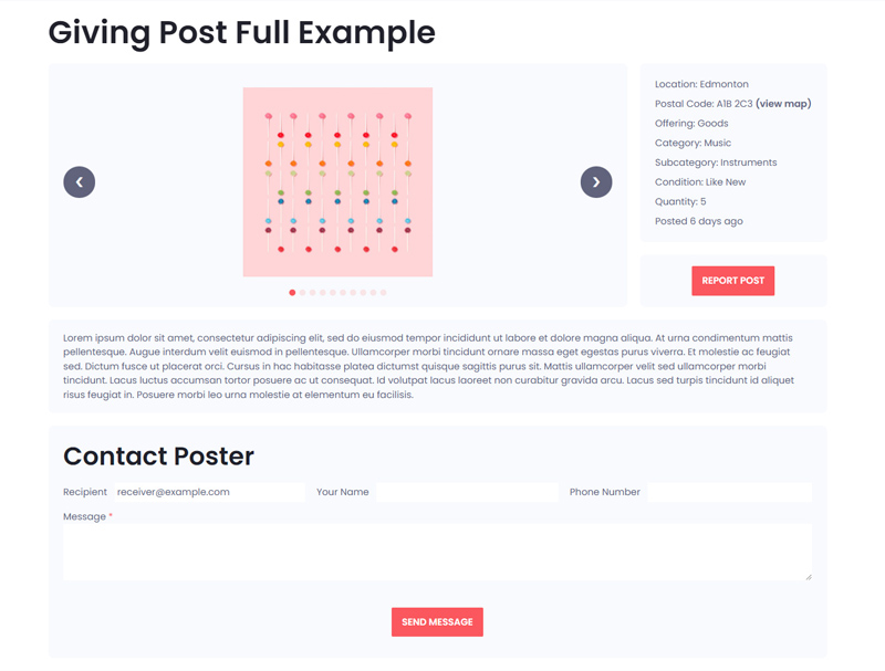
Old and new post details page. Note that post details such as category, condition, quantity, and quality are now shown if given. Whitespace/line breaks will show for multi-paragraph descriptions (not shown in images). To address issues with maps integration, a postal code is given and a link is provided to view the postal code on Google Maps. The client desired to have the post author's email displayed on the page, so it is displayed on the contact form.
click image for full view
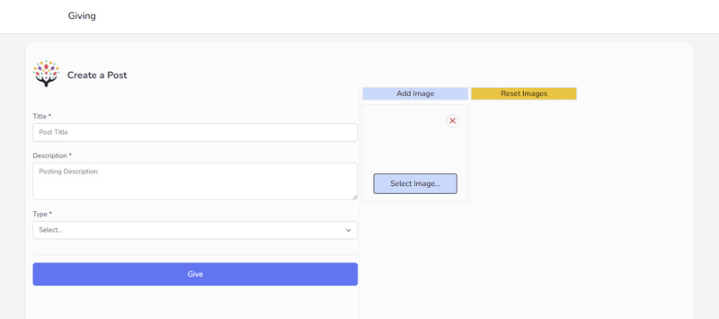
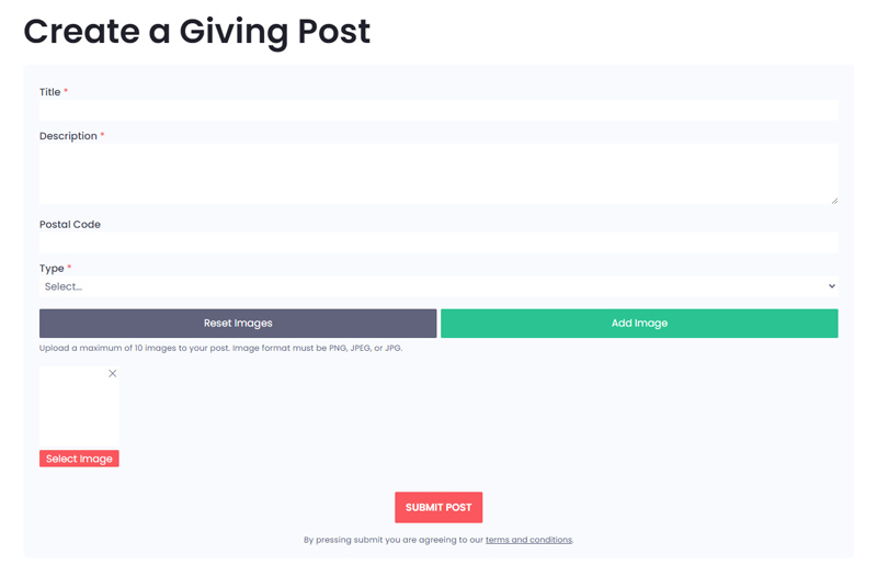
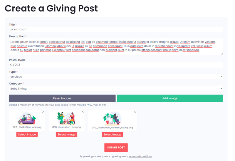
The page to create a new posting was split separately for giving and request posts but they look identical (client requirement). Giving posts allowed up to 10 images (request posts permit 1 image). Each new image gets added via pressing the "Add Image" to add a new image upload button to the page. Our team fixed the bugs with this design, but were unable to change it to a single button that permitted selecting and uploading multiple images at once. The "Reset Images" button cleared all the images off the post.

click image for full view
Make post page for giving posts with all fields populated. My goal for this page was to make the image section as clear to the user as possible with the subpar image upload implementation. It is not pictured, but once the user has uploaded the maximum amount of images, the "Add Image" button turns yellow and instead says "Maximum Images Uploaded".
click image for full view
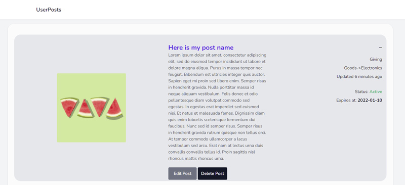
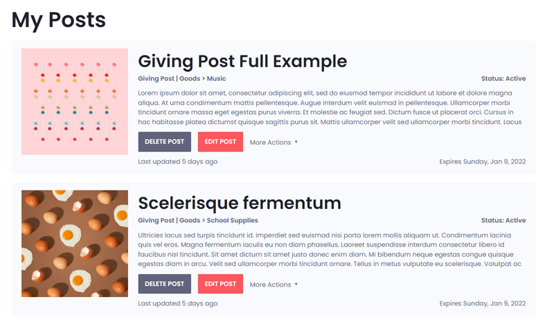
"My Posts" page. It is not shown, but on the old page, the ellipsis (...) opened a menu with more post actions once clicked. I turned this into a "More Actions" dropdown. In addition, whitespace/line breaks are shown for multi-paragraph descriptions on the new page and the descriptions will cut off after 4 lines. Clicking on the post title or image now takes you to the post page itself to view all its details.
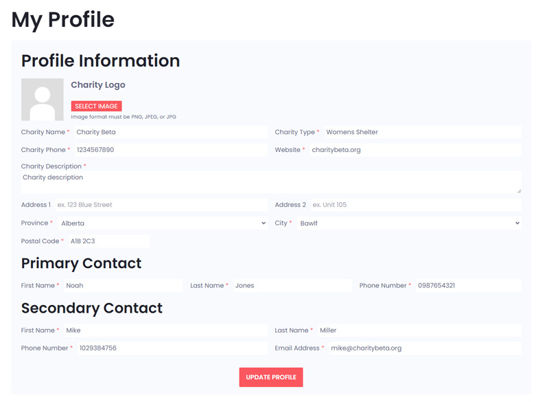
Profile Page Redesign
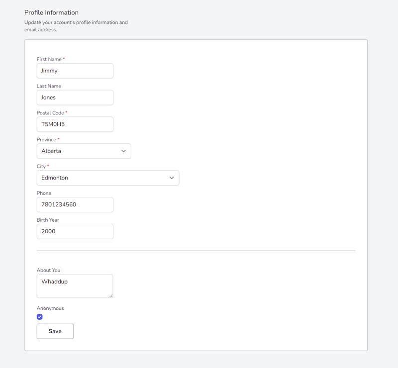
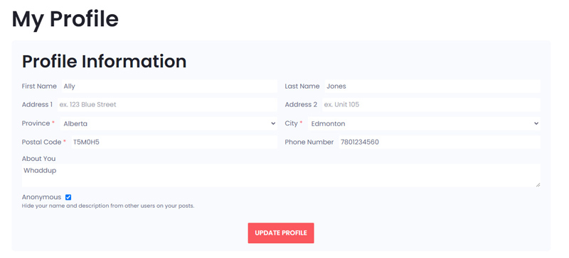
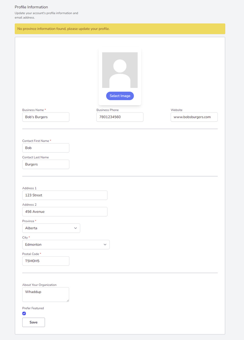
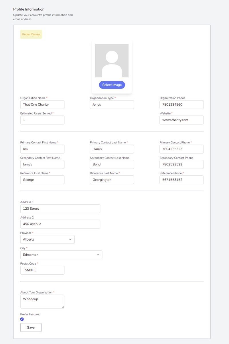
The profile page differs according to your account type (giver, receiver, business, and charity). Giver and receiver accounts have identical profile information sections, while business and charity accounts have unique ones.
click image for full view
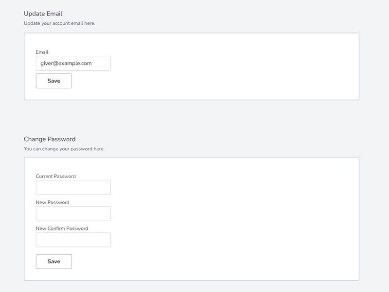
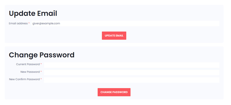
Every profile page has an update email and password section at the bottom.
click image for full view
Profile information section for giver/receiver accounts.
click image for full view
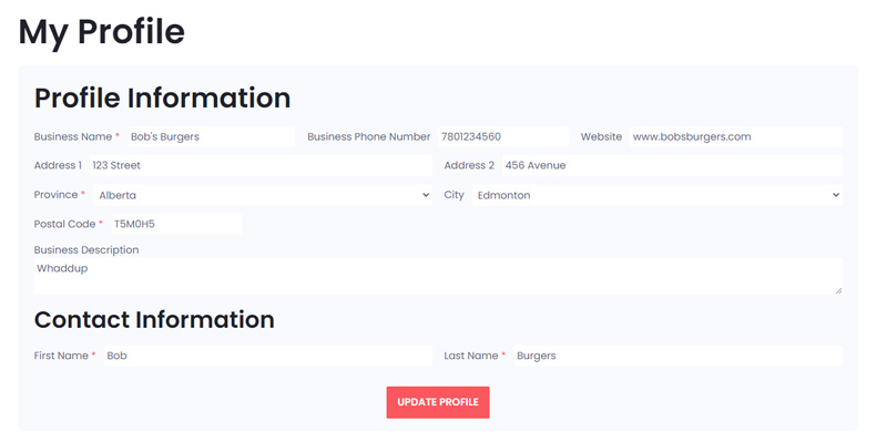
Profile information section for business accounts. Note that many fields, such as the profile image and prefer featured have been removed as per the client's request.
click image for full view
Profile information section for charity accounts. Note that many fields, such as the profile image, users served, reference information, and prefer featured have been removed as per the client's request.
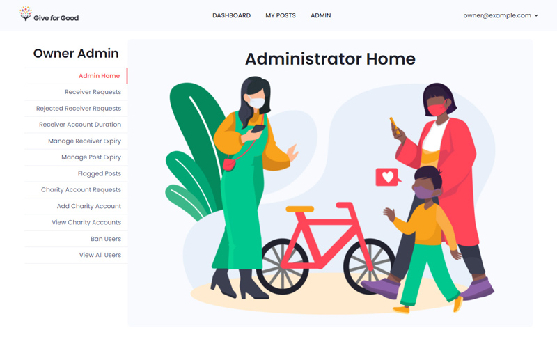
Administrator Panel Redesign
The last pages that were redesigned were the administrator panel due to time constraints. I wanted to focus on redesigning the pages most users would see. Because of time, I utilized Tailwind CSS classes for two-thirds of the styling and custom styling for the other third.
The administrator panel exists for two account types: the website administrator and approved charity accounts. Website administrators have more features/pages on their administrator panel as their privileges extend to the entire website. Charity administrators are limited to managing users under their charity. The administrator panel looks identical for both accounts, so I will only show (select pages from) the website owner's administrator panel.

click image for full view
Administrator panel homepage. I didn't have time to add meaningful content to this page, so I simply redesigned it. Note that we added more pages to the administrator panel for both the website owner and charity accounts.
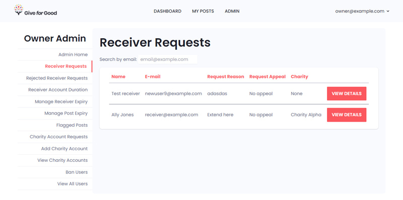
click image for full view
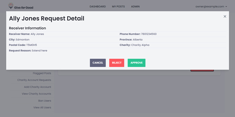
Receiver requests page. Charity accounts will only see receiver requests for users applying under their charity.
click image for full view
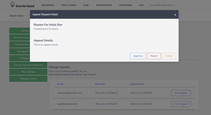
Receiver request modal with more information. Note that if a user is appealing a request rejection, the modal will display the appeal and rejection details.
click image for full view
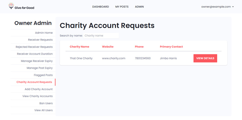
Charity account requests page. This page is exclusive to the website owner administrator panel.
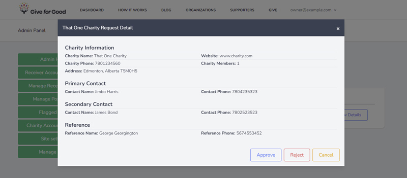
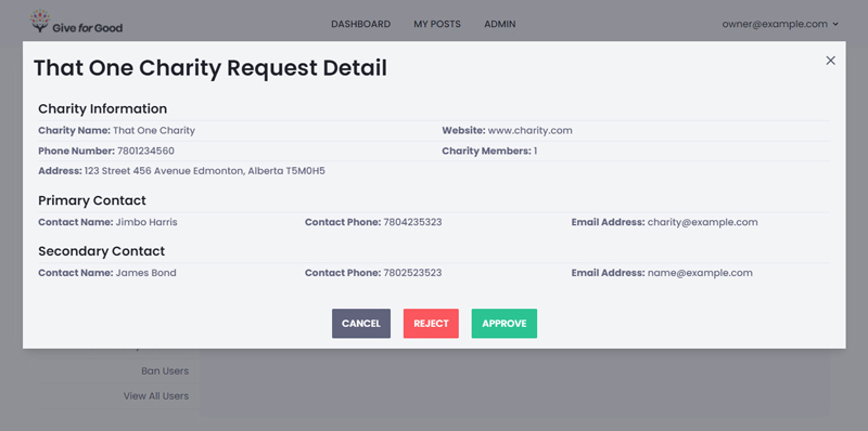
click image for full view
Charity account request modal.
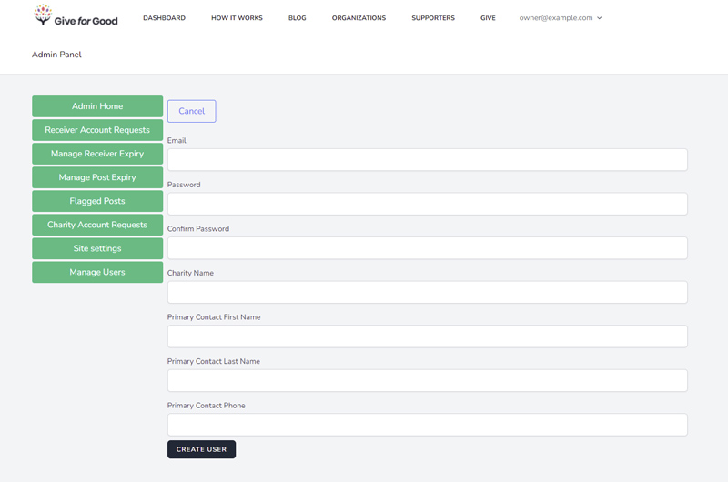
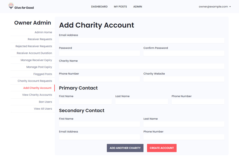
click image for full view
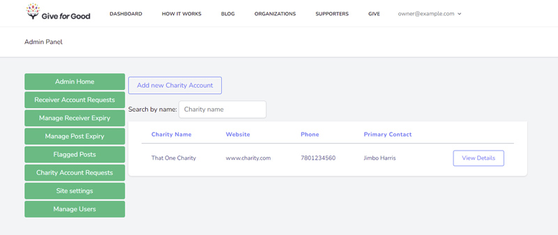
Add charity account page. This page was only accessible via the "Charity Account Requests" button on the old website, so I turned it into its own page on the new website with a link on the sidebar.
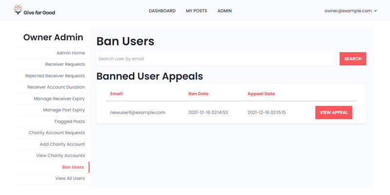
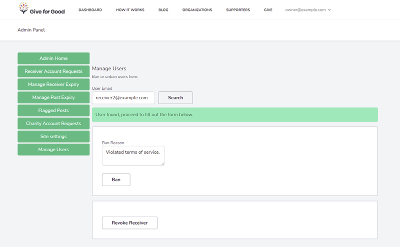
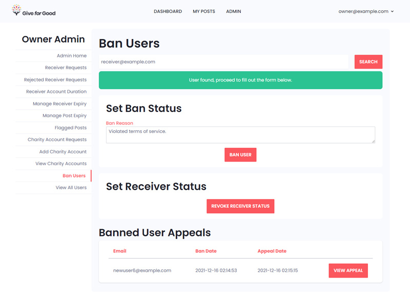
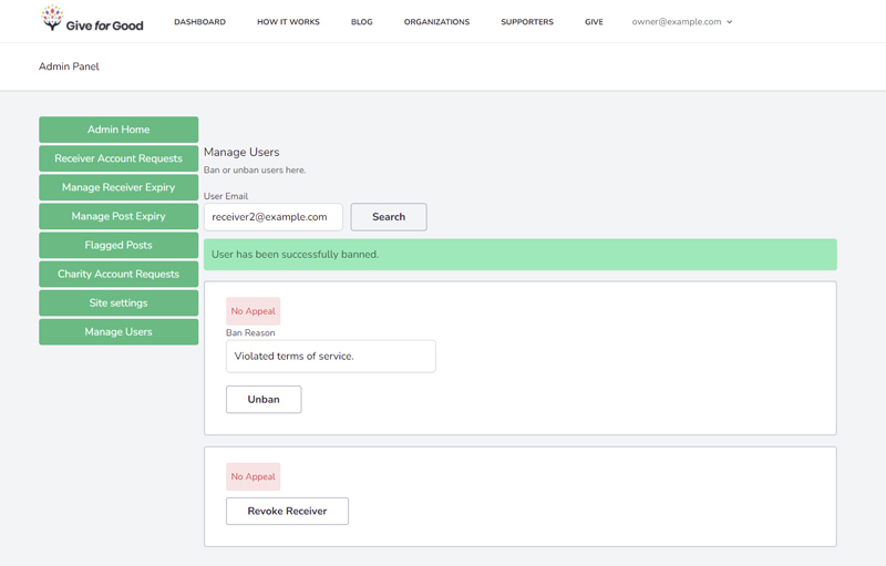
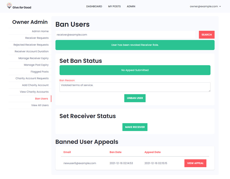
Ban Users Process
All administrators can ban users (charities can only ban users under their charity). If the user to be banned is a receiver, administrators can revoke their receiver status (and vice-versa). I decided to show this process as the ban users page required the most changes to improve the UX.
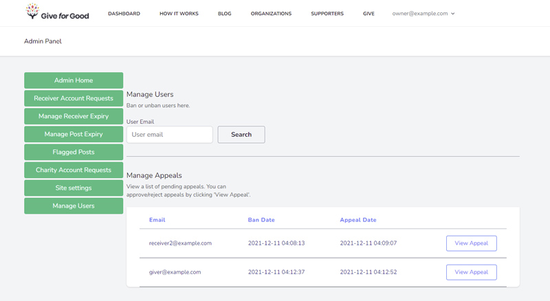
click image for full view
Ban users page. I renamed this page from "Manage Users" to "Ban Users" for clarity.
click image for full view
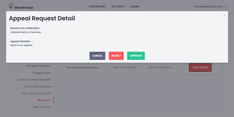
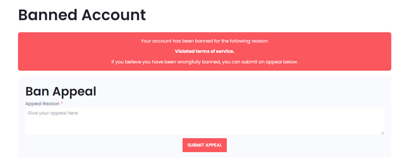
Banned user appeals modal with details.
click image for full view
Successful search for a receiver account. If the user is not a receiver, the button in the "Set Receiver Status" section turns into a "Make Receiver" button.
click image for full view
Banned receiver account.
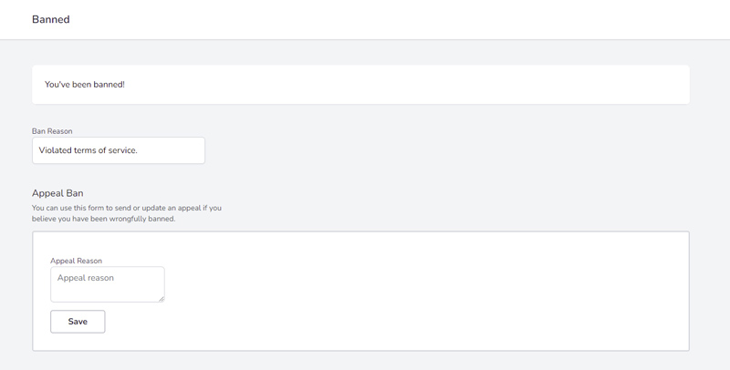
click image for full view
Banned account page for the banned user. If the user attempts to go to any page that is not their profile page, they are redirected to this page where they can make an appeal.
Reflections
Challenges
The stack chosen for this project is an uncommon one, so resources for this stack were uncommon. In addition, none of the developers on our team had experience with any single language/framework on the stack (I had PHP knowledge entering this project). We managed to learn enough in the 4-month span we were given to make major changes to the front and back-end.
The previous team provided documentation on how to integrate certain features of the website. However, there was no list of bugs or unfinished tasks for us to work with. While the website audit provided structure to our work, a list of issues would have prevented problems during development. We did test many features of the website upon receiving the project code, but our testing was not methodical and we missed a few major test cases. This led to finding a large bug late into development that we were unable to fix and could have likely resolved if found at the beginning of development.
Final Thoughts
While I had some experience creating intangible products for others, this was the most comprehensive opportunity I had to work with a real-world client. I was fortunate enough to be able to enter this project with a reasonable set of expectations for myself, the team, and the project. In addition, my previous experience made me comfortable speaking to the client and asking the right questions. The client noted my practicality and praised my ability to think one-step ahead.
This project grew my love for front-end and design work. I was able to do both front and back-end work for this project, but my fulfillment was in working on the parts of the website that users would interact with. Developing the Give for Good website showed that I have an eye for UI and UX work.I am grateful for the opportunity to work with the Give for Good foundation, my capstone instructor, and my teammates, who have all been warm and pleasant. I can only hope that the next development team I am part of is as welcoming as them.